
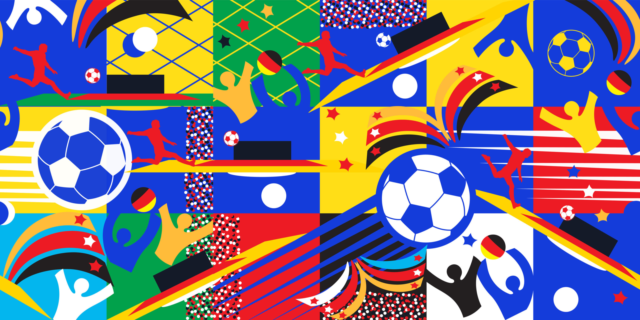
While the EURO 2024 was in full swing, we asked our followers on our Instagram to vote for the football kits they thought were designed the best. This wasn’t about supporting your home team, this was about choosing the kits that embodied the countries within the design. With some kits racking up 50/50 scores, meaning we had to re-match, and others having clear winners – we are pleased to see the winning kits with lots of colour and striking design choices.
Our creative director, Anthony, offers his insight as to why these kits were so popular in our polls. So let’s break them down:
Scotland

With its familiar navy colour and built with a series of monochromatic geometric shapes, it’s a designers delight. Which could easily be seen to make up the patterns chapter of a set of brand guidelines. It’s high contrast of the yellow features creates a striking mix of the vibrant colour against a generally darker palette. The tartan army won’t be disappointed with this kit.
France

A kit after our own hearts, simple displayed at its finest. The royal blue with a very minor white and red trim is a real delight. The cockerel takes centre stage, intentionally oversized and sitting proud. A fantastic display of design restraint from Nike.
Ukraine

Ukraines kit, held little surprise. Proudly sporting the yellow and blue of the flag, that has grown so iconic, in what is otherwise a relatively simple kit. The only entry from the Joma brand in our final 6.
Netherlands

Where else is orange worn this well. A beautifully simple kit, which boasts a very subtle textured pattern on the body – an awesome design detail. A real vibrant delight for the eyes, they’ve got everything right in my opinion on this kit.
England

Following the simplicity of the other Nike kits, the England kit seems to add a little extra finish with a more detailed collar (including the somewhat talked about recoloured flag), and a more retro cuff colour way, of red and blue, synonymous with the England kits of the 80s and 90s. The 3 lions feature against a nearly all white kit – a badge we’re all so familiar with is a nod to nostalgia. A more toned down single star, sits neatly above the badge, adding a nice detail.
Italy

No mistaking this for an Italian kit, attention to detail has not been overlooked. As the colours from the Italian flag drape the arms of the kit, and subtle pin-striping grace the familiar royal blue of the kit. Curved details around the waist make this kit appear trim and fitted.
These designs highlight the creativity in the sports apparel and demonstrate how national pride and modern design can merge to create something truly special on the pitch. As we continue to celebrate such creative achievements, we look forward to seeing how future tournaments will inspire even more innovative approaches to kit design, keeping the beautiful game not just competitive, but visually captivating as well.
Liked this? Learn more about what we do by reading What is a Creative Agency?


