
The story of your business is told through its branding, and aside from your logo, there’s no element more significant than the colours used to represent that identity.
Lauren Labrecque and George Milne, researchers for the Journal of the Academy of Marketing Science, say that “like a carefully chosen brand name, colour carries intrinsic meaning that becomes central to the brand’s identity, contributes to brand recognition, and communicates the desired image.”
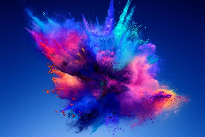
As consumers, we’re bombarded with hundreds of advertisements every day, so it’s important that your own brand leaves a lasting memory. Colour can convey meaning and evoke a response more quickly than any text or logo, so a carefully chosen and researched colour palette, applied consistently across all touch points, should give you the best chance of standing out from that crowd.
There’s no one colour, or combination of colours that will guarantee you success I’m afraid, but there are a number of factors you should consider to ensure that your brand identity is built with your audience in mind, and not just the CEO’s favourite colour.

Context
Your perception of colour is dependent largely on personal experience and of course the context in which it’s seen. Red to one person, or in one environment could mean love, energy, passion, but changing that audience or context could mean that same red conveys anger, defiance, or danger. For those reasons, it’s critical that you’ve fully researched your audience, and your industry, to ensure you’re choosing appropriate colours – while being mindful that the branding exercise should never be intended for you to fit in, but to stand out.
Personality
Jennifer Aiker, a Stanford professor and psychologist says a brand’s personality can be defined by 5 traits;
- Sincerity
- Excitement
- Competence
- Sophistication
- Ruggedness
It’s likely your brand will be defined by one of these traits. See the colour wheel to the right, for a full breakdown of all personality traits.
Industry
While we’ve already established that colour choice isn’t black or white, that doesn’t mean that there aren’t certain trends and colours that dominate particular industries.
For example, it’s no surprise that airlines are dominated by blues and reds, colours closely and regularly associated with dependency and authority, two extremely important characteristics, I imagine, when we’re choosing who to fly with!
Communications and Technology is an industry heavily dominated by shades of blue, a colour of clarity, trust and confidence.
In fact, blue features as the primary colour for 33% of the top 100 brands in the world, followed by red at 29%, and black at 28%. Of those top 100 brands, 95% of them use only one or two colours in their logo branding, This can be explained as an attempt to maintain consistency by keeping their branding simple.
Colour rundown (by MATT SOLAR)
Red
Red evokes a passionate and visceral response. It is a colour that increases your heart rate, makes you breath faster, and is generally associated with energy, excitement, and passion. It’s one of the colours that is attention-grabbing, while it can also be provocative and excitable.
Colour code: aggressive, energetic, provocative, attention-grabbing, passionate
Purple
Purple is a sophisticated yet mysterious colour. It tends to be used with higher-end products due to its association with royalty and elegance. Purple’s mysterious element is also linked with spirituality, and it can bring a magical twist to your branding.
Colour code: royalty, sophistication, nostalgia, mystery, spirituality
Blue
Blue is the most popular colour choice for top brands. It is thought to put people at ease, as it reminds them of the sky and the ocean. Blue is also associated with trust, security, and confidence which make a great combination for the companies that want these elements in their branding message.
Colour code: trustworthy, dependable, secure, responsible, confident
Green
Green is a colour that is synonymous with calmness, safety, and freshness. Its various shades can create a unique brand identity for your company. Green tends to be associated with health along with the feelings of peace and serenity.
Colour code: wealth, health, prestige, serenity, generosity, safety
Yellow
Yellow is a popular colour choice for brands that want to evoke a feeling of positivity in their identity. Its association with the sun on its different shadows brings out hope and optimism. Yellow also stands out among other colours, which makes a yellow brand identity creative and appealing.
Colour code: positivity, light, warmth, motivation, creativity, happiness
Orange
Orange makes an ideal colour choice for brands that want to blend the optimism and the brightness of yellow and the passion and the energy of red. It is a creative and cheerful colour that evokes a friendly and adventurous feeling.
Colour code: vitality, fun, playful, exuberant, outgoing
Brown
Brown represents earthly simplicity and it is usually preferred to reflect stability and strength. It’s comforting in its simplicity and is adopted by brands that wish to be perceived as classical and trustworthy, without proceeding to bold moves. Brown is associated with the earth, but can also remind people of dirt so there needs to be careful use of it, especially if it stands out as the main colour for a brand.
Colour code: earth-like, natural, simplistic, durable, comforting
Black
Black is another popular colour option for brands and it tends to be one of the most classic options. It’s both smart and sophisticated and it can make a brand identity really stand out. It seems to work perfectly with luxury products, blending classic and powerful elements. Black is one of the colours that can be combined with others to add a stronger emotion, without losing its classical appeal.
Colour code: prestige, value, timelessness, sophistication, power
White
White represents simplicity, purity, and also cleanliness. These three make it extremely popular in the healthcare sector, in the cleaning business, but also in child-related businesses. White can also bring about a feeling of trust by tapping in to purity and simplicity.
Colour code: pure, noble, clean, soft


