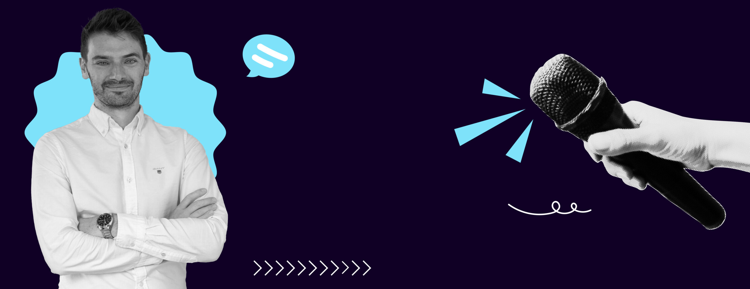
DayOne prides itself on the fact that when you work with us you can talk directly with the graphic designers. There’s no middle man. It means when you have a question or vision you can email/message us directly. By highlighting the professional insights of our designers, we hope to demonstrate our commitment to excellence and the passion we have that defines our work. This series will interview our designers to provide a deeper understanding of the artistic minds that drive your projects.
Essentially, we think it’s only fair you get to know us! We’ve put together a few questions about our work at DayOne for you to get to know us better. Up first, it’s our Creative Director, Anthony.

1.What is the most rewarding aspect of being a graphic designer at DayOne?
There’s a whole host of scenarios which are rewarding here, but there’s few things that make me happier than seeing the other designers find a perfect solution for a client, after having poured themselves into a project, which had proved a tricky one to unlock initially.
2.What’s your favourite typeface?
Oh jeez. It really depends on the usage occasion, but it’s difficult to see past the god-status of Helvetica. I also love Circular, by Swiss designer Laurenz Brunner, as one of the few fonts which works almost anywhere. Recent favourites which are a little more ‘adventurous’ in our work have been extended or wide typefaces, GT-America has a very well crafted expanded version. Shoutout as well to a new serif find on the Adobe Typekit, Open Seasons, lovely in both roman and italic.
*The images in this journal are examples of Anthony’s favourite fonts.

3.How do you stay updated with current graphic design trends and techniques?
Designers by nature, are usually really active in looking at latest works and campaigns, and exploring ways in which their work can be taken to the next level. My resources these days are the classics still, Campaign and Marketing Week. But ‘its nice that’ is a great resource for latest design excellence, as well as the less sexy, Pinterest! I also find myself lost in ‘Creative Boom’, which is a great resource for designers.
4.What tool or software do you use the most?
I spend my day on ClickUp, which we’ve customised to within an inch of it’s life to work for us seamlessly managing our clients project’s, and our own internal processes. Outside of that and from a design perspective, we live on the Adobe Creative Suite.

5.What project are you most proud of at DayOne, and why?
There’s been many, but the one which springs to mind straight away is the train station takeovers we did in London and Manchester, where we wrapped WHSmith stores, in graphics for our client, C4 Energy. Made extra special due to the partnership and product we were promoting, which was for ReOrg. The sheer scale of this project was one which the whole team could be proud of.
6.What’s a design trend you’re excited about right now?
Its difficult to not talk about Visual Generative AI here, which is a topic I’m sure we’re all sick of reading about. But, some of the imagery (and future possibilities) we are able to produce using MidJourney is just so exciting.

7. What’s your biggest design ick?
Drop Shadow on text (Flicks back through own portfolio to check none appears on ours!). It’s so rarely required.
8. How do you keep the team motivated?
I’ve always tried to create an open, honest and creative culture, encouraging all our team members to take the lead on their assigned tasks. Also, a fair bit of pizza!

Want to know more about the DayOne creatives? Read Gemma’s interview here!


