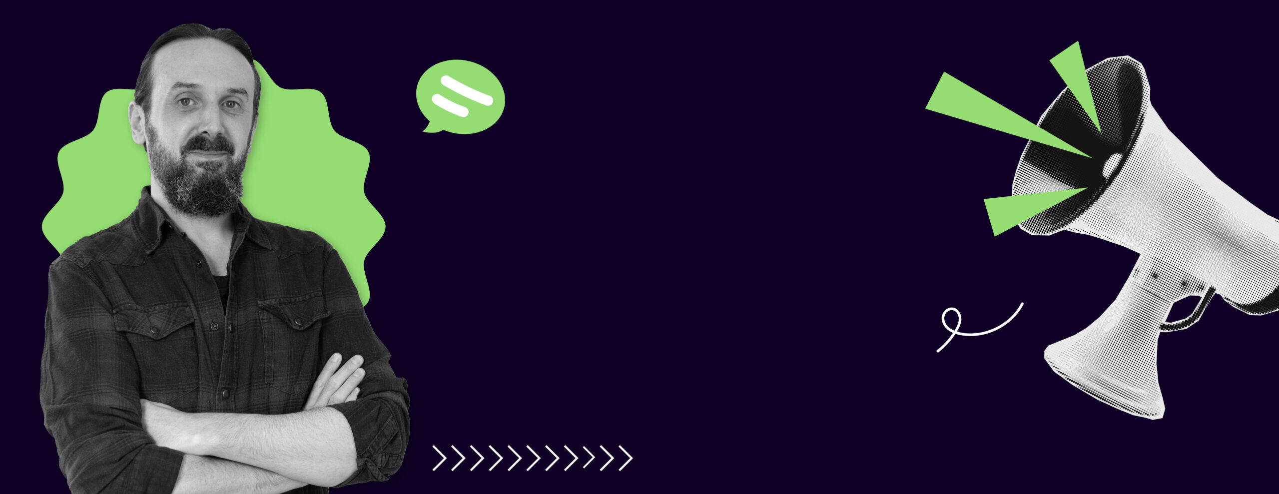
DayOne prides itself on the fact that when you work with us you can talk directly with the graphic designers. There’s no middle man. It means when you have a question or vision you can email/message us directly. By highlighting the professional insights of our designers, we hope to demonstrate our commitment to quality and the passion we have that defines our work. This series will interview our designers to provide a deeper understanding of the artistic minds that drive your projects.
Essentially, we think it’s only fair you get to know us! We’ve put together a few questions about our work at DayOne for you to get to know us better. Next is our Senior Designer Steve.

1.What is the most rewarding aspect of being a graphic designer at DayOne?
Working on all kinds of different projects for a wide variety of clients.
2.What’s your favourite typeface?
This is like asking my favourite song – there’s lots, and if you asked me again next week the answer would probably be different. My 3 favourites today – a sans, a serif, and a display font – are:
Neue Haas Grotesk, a modern revival of Helvetica by Christian Schwartz
Exchange, a news text face made by Tobias Frere-Jones, originally for a redesign of the Wall Street Journal
Maelstrom Sans, an eccentric, experimental, super-high-contrast font by Kris Sowersby
*The images throughout this Journal are examples of Steve’s favourite fonts!

3.How do you stay updated with current graphic design trends and techniques?
Partially by following blogs like https://www.itsnicethat.com/, https://abduzeedo.com/, and https://eyeondesign.aiga.org/ but also just by keeping my eyes open and being aware of design I see out in the world – TV, magazines, billboards, etc.
4.What tool or software do you use the most?
InDesign, closely followed by Photoshop and Illustrator.

5.What project are you most proud of at DayOne, and why?
Of all time? Probably Consensio magazine; more recently, the annual Austin Friar for the Furniture Makers’ Company, and also the Oxford International College prospectus that was finished this week. The ‘why’ for all of them is simply that I’m very happy with how they all turned out, which also means the clients have been great to work with. Check out our work for Consensio magazine and their testimonial here and the Austin Friar here.
6.What’s a design trend you’re excited about right now?
The name is a bit of a misnomer, but I find the anti-design trend interesting. The name suggests design that is intentionally bad – and in some cases that’s probably accurate – but really it’s more about knowing and breaking established rules and experimenting. Results can vary but I think it’s always worth trying something different when you can.

7. What’s your biggest design ick?
This has been around for a while now and although it’s starting to die off, it is still lingering around – ‘wackaging’, overly cutesy, quirky branding or messaging on products. When it was originally done by Innocent Smoothies, it was fairly innovative and a bit tongue-in-cheek, but was almost instantly poorly imitated by every brand and its dog and spread everywhere. At its worst it’s infantilising and just very cringe – way too ‘how do you do, fellow kids’.

8. Who’s killing it in the office (and why)?
Creative Director, Anthony for bringing in lots of new clients over the last few months and for keeping on top of everything!
Want to know more about the DayOne creatives? Read Anthony’s interview here!


