What is the Importance of Engaging Business Reports?
Business reports serve as a crucial tool for communication within companies, providing stakeholders with essential insights and data. However, these documents can often appear dry and tiresome, filled with complex data and mathematical analysis that may not engage the reader. Incorporating good graphic design into business reports can transform these critical communications into compelling narratives that capture attention and convey information effectively.
Why Does Visual Appeal Matter in Business Reports?
The primary goal of any business report is to communicate information clearly and persuasively. A well-designed report can achieve this by breaking down difficult information into smaller pieces that are easy to understand and appealing to the eye. Graphic design can introduce elements such as charts, graphs, and infographics, which not only make the data more accessible but also more engaging. By enhancing the visual presentation, businesses can ensure that their reports are not only read but understood and acted upon.
Will our reports be clearer?
Graphic design plays a pivotal role in enhancing the clarity of business reports. Designers use colour, typography, and layout to highlight key points, draw attention to important data, and guide the reader through the information logically and intuitively. These visual cues help to maintain the reader’s interest and facilitate a better understanding of the content.
5 Tips On How To Make Business Reports Captivating Using Graphic Design
- Use Infographics: Convert complex data into easy-to-understand infographics. This can include charts, graphs, and diagrams that break down information visually, making it easier for readers to grasp trends, comparisons, and statistics at a glance.
- Consistent Branding: Ensure that all reports reflect your brand’s visual identity. Use your brand’s colour scheme, fonts, and logos consistently throughout the report. This not only enhances aesthetic appeal but also strengthens brand recognition and cohesion across all communications.
- Hierarchical Typography: Employ a clear hierarchy in your typography to guide the reader through the report. Use varied font sizes, weights, and styles to differentiate between headings, subheadings, and body text. This structuring aids in navigating the document and emphasises important points.
- Effective Layouts: Organise content in a clean and accessible layout. Ensure there’s a good balance between text and white space to prevent overcrowding of information. Clearly sectioned content with ample margins and spacing can significantly improve readability.
- Enhanced Visual Elements: Integrate visual elements such as icons, images, and callout boxes to highlight key information or illustrate points. Visual aids not only break up the monotony of text but also engage the reader and can help explain concepts more effectively than words alone.

Case Study: Marlowe Theatre
We are proud to have the Marlowe Theatre as a longstanding and valued client. Each year, we have the privilege of designing their Annual Report, a key document that highlights the incredible work they do within the arts community.
Our approach is centred on creating a report that not only captures the vibrancy and boldness of the Marlowe’s accomplishments but also remains highly readable and engaging. We understand that an Annual Report serves a dual purpose: it must present important information clearly and professionally while offering a design that reflects the theatre’s creative spirit.
We take great care to ensure that each report is visually striking, with a cohesive brand identity that reinforces the Marlowe’s reputation. By balancing creative flair with clarity, we help readers cut through the usual clutter of corporate reports, allowing the content to shine. Ultimately, we aim to produce a document that is not only informative but also a pleasure to read, leaving a lasting impression on stakeholders and theatre supporters alike.

Case Study: Carousel Danx
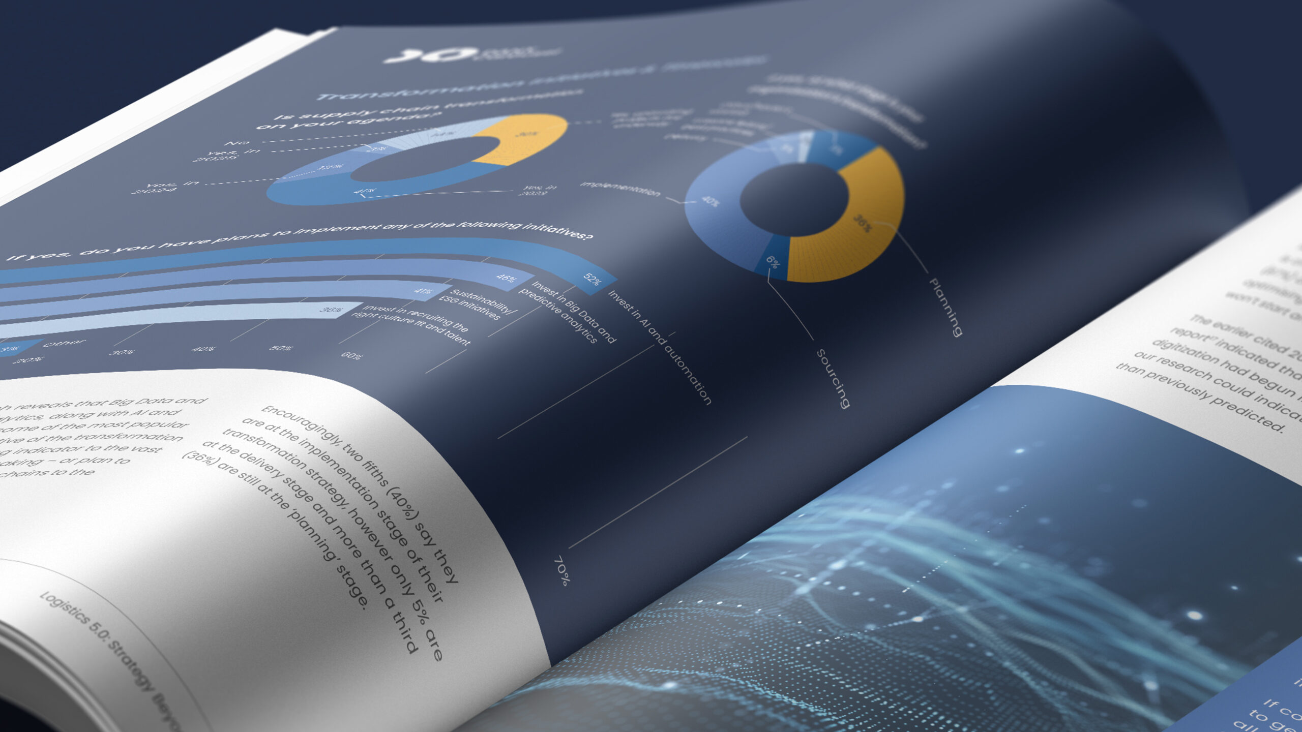
When Carousel Danx set out to produce their latest white paper, they faced a familiar challenge: presenting complex, data-heavy content in a way that was clear, engaging, and aligned with their brand identity. White papers, by nature, can be dense and difficult to navigate, making it essential to turn them into documents that captivate the reader while conveying key insights effectively.
To tackle this, we focused on visual storytelling and data illustration. Complex information was broken down into manageable sections using attractive, dynamic charts and infographics. These visuals allowed readers to grasp essential points quickly, making the content more accessible and enjoyable. Throughout the document, subtle visual cues and a cohesive design language were used to maintain consistency with the Carousel Danx brand. The final product was a white paper that balanced informative content with engaging, reader-friendly design, ensuring that the key messages were communicated clearly and with impact.
Ultimately, the integration of considered graphic design into business reports does more than just make things look pretty; it ensures that the information is accessible and engaging. By making reports visually attractive and easy to navigate, businesses can encourage deeper engagement from their audience, prompting more informed decision-making and stronger business outcomes.
If your business is looking to update its reporting and communication strategy, consider using a professional graphic designer. Reach out to us at DayOne, where we specialise in turning complex data into compelling visual stories.


